Your YouTube video might have amazing content, but if your thumbnails and channel art don’t stand out, people won’t even click to watch. Think of thumbnails and banners as the first impression of your brand—clear, catchy, and memorable. Here’s how to design visuals that not only attract attention but also build long-term recognition.
1. Understand the Role of Thumbnails and Channel Art
- Thumbnails are your video’s mini billboards. They need to stop the scroll and make viewers curious enough to click.
- Channel art (banner and profile picture) establishes your brand identity. When designed well, it reassures new visitors that your channel is professional and worth subscribing to.
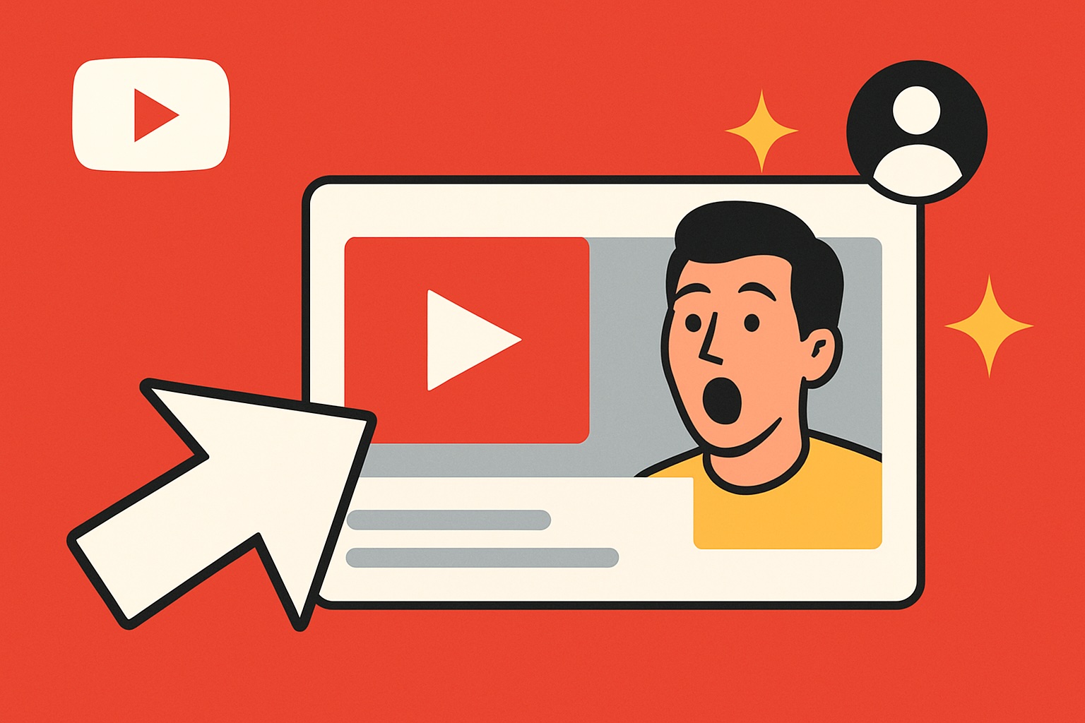
2. Keep Thumbnails Simple and Bold
- Use large, readable text: Avoid small or cluttered fonts. Stick to 3–5 impactful words.
- Close-up faces with emotions: Humans connect with expressions—surprise, laughter, shock all work well.
- High contrast colors: Bright backgrounds and strong contrasts make your video stand out in YouTube’s sea of gray and white.
- Avoid clutter: One strong image is better than many small ones.
👉 Pro Tip: Imagine your thumbnail on a phone screen. If it’s unreadable or unclear at that size, simplify it.
3. Use Consistent Branding
- Color palette: Choose 2–3 colors that define your channel’s look.
- Typography: Stick to one or two fonts across thumbnails.
- Logo or icon: Place a small, consistent element (like your logo) in a corner for brand recognition.
- Style guide: Whether you prefer bold text, cut-out images, or cinematic stills, keep the style consistent so viewers can recognize your videos instantly.
4. Design Channel Art That Tells Your Story
Your banner is prime real estate—it tells visitors what your channel is about before they watch a single video.
- Clarity over design tricks: In one sentence or phrase, explain what your channel offers.
- Optimized layout: Remember banners display differently on TV, desktop, and mobile. Keep the key elements in the “safe zone” (center 1546 × 423 px).
- Show your niche visually: For example, if your channel is about travel, include iconic landmarks or a world map in the background.
5. Test, Analyze, and Improve
Don’t just design once and forget it—experiment.
- A/B testing: Swap between two thumbnails and track CTR (Click-Through Rate).
- YouTube Analytics: Look for “impressions vs. clicks” to see if your designs are working.
- Iterate: Sometimes a small change in color or text boosts CTR dramatically.
6. Tools You Can Use (Free and Paid)
- Free: Canva, Photopea, GIMP
- Paid: Photoshop, Affinity Photo
- Stock resources: Unsplash, Pexels for high-quality images
- Templates: Many tools provide ready-made YouTube thumbnail and banner templates—use them as a starting point.
7. Final Checklist Before Uploading
- ✅ Text is readable on mobile
- ✅ Colors pop against YouTube’s background
- ✅ Emotion or curiosity is visible in the image
- ✅ Channel art communicates your niche clearly
- ✅ Design style is consistent with your brand
Conclusion
Good thumbnails and channel art aren’t just decoration—they’re a click magnet. By keeping designs bold, consistent, and brand-focused, you’ll not only boost your CTR but also make your channel look professional and trustworthy. Over time, this consistency helps build recognition, loyalty, and ultimately, more subscribers.